Wednesday, February 24, 2010
Saturday, February 20, 2010
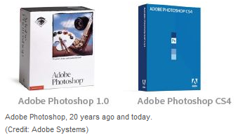
Photoshop, a software industry fixture, turns 20
It's not often that a technology product, even a successful one, enters the language as a verb. Some of us google, but nobody iPhones, Excels, or HDMIs.
But by remaining influential over a history that now spans 20 years, Photoshop software has achieved a place in the English language. Over its two decades, it grew from a single black-and-white image-editing package to a multi-product franchise, a starring member of Adobe Systems' Creative Suite line, and, of course, a verb.
At a National Association of Photoshop Professionals event Thursday in San Francisco, Photoshop's movers and shakers will gather to toast the software. For those who can't be there, here's a look at the software's history and future.
Photoshop got its start in 1987 when Thomas Knoll wrote software that could display grayscale images--those with a range of gray tones--on monitors that could show only black or white pixels. He and his brother, John Knoll, licensed the software to Barneyscan in 1988, then to Adobe in 1989. Adobe Photoshop 1.0 arrived in 1990, a Mac-only product initially, and in 1995, Adobe acquired the Photoshop software outright.
Pixel-level manipulation software turned out to be popular. Photoshop's clone tool let people copy one part of an image to another. And even at this early stage, it enabled sophisticated tonal controls through levels and curves adjustments.
Photoshop acquired many more features over the years. By providing a nicer interface to raw mathematical image-processing algorithms, Photoshop let people sharpen edges and change colors. Layers enabled creation of composites that blended multiple photos, text, and other elements. Adjustment layers opened up the idea that changes could be revisited rather than baked into the pixel data. Camera lens problems could be corrected.
The software gained popularity in a variety of areas--publishing, art, photography, advertising--and specific features followed. Narrower markets arrived, too--police forensics, medical diagnostics, scientific analysis.
The biggest and possibly most infamous feature, though, is the ability to make people look more attractive. Curves get curvier, skin gets creamier, teeth get whiter, muscles get chunkier, lips get plumper.
In many circles--advertising, most notably--this is considered fair game. But elsewhere, where many people still expect a photograph to capture truth, image manipulation has caused controversy.
Did 2004 presidential candidate John Kerry really stand next to Jane Fonda in a 1970s anti-war rally? No, but with each passing year such manipulations become easier. That "Photoshopping" has come to be synonymous with image manipulation and sometimes outright fakery shows we're getting more sophisticated about the possibilities, but you can bet we will be fooled again.
Adobe's Photoshop franchise has been expanding gradually. At the lower end, where people rarely are willing to spend hundreds of dollars for software, the company has released a cheaper enthusiast version, Photoshop Elements. Adobe killed the free Photoshop Album Starter Edition version.
Another new direction for the software was the photography-specific Lightroom. This software is tailored for high-quality "raw" images that come directly from camera image sensors and handles cataloging, captions, titles, and other image management matters.
The company continues to work on the core Photoshop product, too. For example, it's got refinements in the works to automate one of the most difficult processes, selecting complicated subjects to isolate them from backgrounds.
Adobe now faces new challenges, though, as computing moves into domains where Adobe doesn't have its incumbent power: increasingly powerful mobile computing devices and the cloud. To cover its bases, Adobe has released the online Photoshop.com and Photoshop for the iPhone.
Even though today's explorations of photography's social dimension are largely taking place beyond Adobe's sphere of influence, though, Photoshop doubtless will remain a fixture of image editing for some time.
Friday, February 19, 2010
Tuesday, February 16, 2010
Monday, February 15, 2010
Buzz: Google Needs Better 'People Skills'
Google's inability to deal with people issues--like Buzz privacy and Nexus One customer support--makes the company look technically sophisticated but socially inept.
Google's millionaire genius-nerds need to learn what real people expect from technology and how to deliver it.
Forget for a moment that Google Buzz meets no obvious need, and consider just the human factors.
There are both privacy and functionality issues with Buzz. The social network, as introduced this week, was a privacy nightmare and a hard one to use, at that.
Given the option, Google's choice for default settings were what benefited Google the most, not what best protected its consumers.
This is what happens when a company is too engineering driven and strives to make only fact-based decisions.
It is hard to complain about the Buzz technology itself, as creating followers automatically from mail contacts is a neat trick. So it follows that making those automatic connections public allows more connections to be made, right?
It does, but...
Goggle missed the fact that making automatically-generated contacts visible to the entire world--by default--might creep some people out and even endanger the safety of others.
That's not something they teach in engineering school.
To its credit, the Google was fairly quick to make changes, but these could go farther. Google needs to adopt a mindset of defaulting to the most restrictive privacy settings and then explaining to users the pluses and minuses of being less restrictive.
Google needs to be asking itself, "How did this happen?" Another episode could earn the company the same sort of reputation for privacy cluelessness that Facebook has captured.
As for the Nexus One, it likewise never seems to have occurred to Google that its customers might demand support, especially personal support, or that setting Early Termination Fees much above the industry norm might be considered abusive.
The good news here, too, is that Google has tried to make amends. The better news is that handsets are not a core business for Google--I don't expect them to sell smartphones for long--so these problems aren't likely to continue indefinitely.
Privacy, however, impacts everything Google does. That the company could get Buzz privacy so terribly wrong is reason for serious concern.
Google needs to learn when to put people first and technology second.
David Coursey has been writing about technology products and companies for more than 25 years. He tweets as @techinciter and may be contacted via his Web site.
Friday, February 12, 2010
Usage share of web browsers: Top 5 browsers
xBhp: The Gift A Dream Ride
Dreams are one of the most powerful forces in the world. They can bring about real life changes which can affect a person and a whole world. Many underprivileged children in India cannot even dare to dream because they dont even have an immediate future. Their present is threatened by meagre resources and apathy from people who can help them.
Everyone who is reading this has the resources to get onto the internet and pay for it. For many of us, food and other basic amenities and taken for granted.Not so for these young children.
We must thank god that we have managed to get what we have today, and we must learn to share, even a little to enable these children to get up on their feet and become someone, someday.
Here is your chance. A gentleman named Rahul (aka Bluevolt on xBhp) is going around India (the Golden Quadrilateral) on his Ninja 250 for 6700kms in 16 days to raise money for a NGO called Dream a Dream. The ride will start from 12th Feb from Bangalore and end on 28th Feb 2010.
The aim of The Gift A Dream Ride is simple: to enable the future of this country, the children, especially the underprivileged, to afford to dream. YOU can do your bit right now by donating a very modest sum of money to the Dream a Dream NGO and help them do this task.
This is a sincere appeal to everyone can afford two meals everyday, an appeal to understand that we need to give back something to our society, and we need to earn our good karma!
Following links will give you a lot more details:
* About Rahul, his background, motivation and the aims of The Gift a Dream ride.
* The Gift A Dream Ride's route plan
* REAL TIME updates from Rahul on the road (or follow him on Twitter)
* How to Donate (offline and online)
We at xBhp.com salute the spirit of Rahul, who has take the pains and effort to do this ride on his own initiation. We are very proud to support him and wish that many people who are reading this, come out of their cocoon and at least take the pains of making a few mouse clicks to donate an amount to his cause.
More info: http://www.xbhp.com/gad/
Opera claims new beta is fastest browser
Opera moves its latest browser build out of alpha development and into beta and claims that Opera 10.50 beta is the fastest browser currently available. It's not clear at the moment whether it's faster than Google Chrome's development builds, or merely as fast as, but there's no doubt that this new beta should draw a lot of attention for its performance.
Opera 10.50 makes dramatic changes to the browser's engine and look, including moving menus behind a minimalist drop-down.
(Credit: Screenshot by Seth Rosenblatt/CNET)
For users who didn't take a look at the pre-alpha builds released in December 2009 and January 2010, Opera 10.50 has been fully optimized for Windows 7, sporting a new interface, full Windows taskbar integration, and, most notably, a new JavaScript engine that Opera claims makes it faster than Google Chrome.
The new Carakan JavaScript engine is the most important improvement, and the reason behind the browser's faster performance. In empirical tests performed last month on an HP desktop running an Intel Core 2 Q6600 at 2.66GHz with 4GB of RAM and Windows 7 32-bit, the Opera 10.50 pre-alpha scored 435.6 milliseconds in the SunSpider JavaScript benchmark. By contrast, Google Chrome 4.0.266.0, the most recent development build at the time, notched 510.4 ms. Opera 10.10, the current stable build, was more than 7.5 times slower, at 3284.4 ms.
Opera's new interface has been optimized for Windows 7 or Vista. The tabs are now on top, the menu bar has been minimized behind a drop-down on the left nav, and the integration with Windows 7 is robust. Jump lists have Opera Speed Dial support and can start a private browsing tab, while the taskbar gets Aero Peek tab preview windows. These have been so well integrated at this point that the fact that Chrome doesn't have all of them and that Firefox doesn't have them turned on by default at this point stands out.
Several features that weren't in the pre-alpha have now shown up in the beta. One of these is a smart recycle bin icon near the minimize and close window buttons in the upper right of the program window. Click it and you get a list of closed tabs, and a list of blocked pop-ups. The CTRL+Tab hot key look has changed, too. Instead of displaying all the open tabs, pressing the combo will open a preview of the tab on the right, with the Web site's meta-tag name on the left.
Other changes include introducing the same style of predictive smart searching in the address bar that Firefox and Chrome have, keeping track of search history in both the address bar and the search bar, and deleting specific items from those histories. Opera 10.50 also includes improvements to the Presto layout engine, a new graphics library called Vega, and support for HTML 5 and CSS 3.
Throughout several hours of use on a Windows 7 computer, the beta didn't crash, nor display any obvious signs of bugginess. In general, Opera 10.50 beta is surprisingly stable and innovative. Mac and Linux users will have to console themselves with the Opera 10.50 pre-alpha for now, although Opera says an update is imminent.
Wednesday, February 10, 2010
Design Trends (Predictions) in 2010
As we are stepping in a new decade, I can foresee that web design in 2010 is going to be fun and filled with experimental works. With the new CSS3 and HTML5, designers and developers are trying to utilize the new features to create impressive designs. Sketchy and large background styles are fading out. Serif fonts and texturized background will be popular. Thanks to CSS3, we are going to see a lot of rounded corners, RGBA transparency, and drop shadows. With the rise of smart phones, mobile web design is going to pick up this year.
Serif Fonts
In the last decade, most web sites were designed in either Verdana or Arial (sans-serif fonts), but that is going to change in this new decade. Serif fonts will get more attention. Read this article to find out why: Next Serif Trend.
Big Headings
Big headings in header (as part of design interface) will gain more popularity in 2010.
Custom Font Embedding
As Typekit is expanding their font list and more free quality fonts are available (e.g. FontSquirrel, OpenType, and The League of MoveableType), I think more people will use custom font embedding in the coming year.
Texturized Background
The big background trend is going to be gradually out-of-date and be replaced with subtle and texturized (particularly the light noise) background.
Minimalist & Grid
Minimalist and grid designs are not today’s new. They have been popular for the past couple years and I think it will continue to grow in 2010. Check out my previous post for more minimalist sites.
CSS3 New Features
Although CSS3 is not fully supported by all browsers yet, but a lot of designers are experimenting with the new features such as: rounded corners, multi background images, multi-column, border images, and animation. The following sites show good implementation of CSS3’s new features with fallbacks. So, we will see more and more CSS experimental works.
CSS3 Animation
Neutron Creations’s blog uses webkit-transform to spin the circle graphics (view it with Mac Chrome or Safari). If your browser doesn’t support webkit-transform, it will just show the static circles.
Rounded Borders and Box Shadows
Border-radius and box-shadow are the most commonly used CSS3 properties.
Text Shadow
A lot of designers are using text shadow to add more depth to text.
RGBA & Opacity
RGBA makes setting background opacity easier. I think more designers are going to take advantage of this feature to create semi-transparent effect.
Mobile Design
Since the release of iPhonein 2007, everybody is talking about mobile design. Now with more smart phones that support full CSS and Javascript, mobile design is definitely going to be the future of web design. A lot of sites(ranging from design agencies to editorial sites to web apps) are offering a mobile version. Below are some great examples (screenshots are captured with iPhone).
Conclusion
2010 is going to be a new adventure for web designers and developers. I and many people (from the Twitter replies) believe that, CSS3 is going to be wowing this year. If you haven’t checked out CSS3 and HTML5 yet, you should really look into it because they will change the way you design and code. You can take advantage of the new features to create cleaner and more efficient layout. For example, instead of writing extra div tags to display multiple background images, we can eliminate it with CSS3. Instead of writing div id="header" tag, we can simply write in HTML5.
Serif Fonts
In the last decade, most web sites were designed in either Verdana or Arial (sans-serif fonts), but that is going to change in this new decade. Serif fonts will get more attention. Read this article to find out why: Next Serif Trend.
Big Headings
Big headings in header (as part of design interface) will gain more popularity in 2010.
Custom Font Embedding
As Typekit is expanding their font list and more free quality fonts are available (e.g. FontSquirrel, OpenType, and The League of MoveableType), I think more people will use custom font embedding in the coming year.
Texturized Background
The big background trend is going to be gradually out-of-date and be replaced with subtle and texturized (particularly the light noise) background.
Minimalist & Grid
Minimalist and grid designs are not today’s new. They have been popular for the past couple years and I think it will continue to grow in 2010. Check out my previous post for more minimalist sites.
CSS3 New Features
Although CSS3 is not fully supported by all browsers yet, but a lot of designers are experimenting with the new features such as: rounded corners, multi background images, multi-column, border images, and animation. The following sites show good implementation of CSS3’s new features with fallbacks. So, we will see more and more CSS experimental works.
CSS3 Animation
Neutron Creations’s blog uses webkit-transform to spin the circle graphics (view it with Mac Chrome or Safari). If your browser doesn’t support webkit-transform, it will just show the static circles.
Rounded Borders and Box Shadows
Border-radius and box-shadow are the most commonly used CSS3 properties.
Text Shadow
A lot of designers are using text shadow to add more depth to text.
RGBA & Opacity
RGBA makes setting background opacity easier. I think more designers are going to take advantage of this feature to create semi-transparent effect.
Mobile Design
Since the release of iPhonein 2007, everybody is talking about mobile design. Now with more smart phones that support full CSS and Javascript, mobile design is definitely going to be the future of web design. A lot of sites(ranging from design agencies to editorial sites to web apps) are offering a mobile version. Below are some great examples (screenshots are captured with iPhone).
Conclusion
2010 is going to be a new adventure for web designers and developers. I and many people (from the Twitter replies) believe that, CSS3 is going to be wowing this year. If you haven’t checked out CSS3 and HTML5 yet, you should really look into it because they will change the way you design and code. You can take advantage of the new features to create cleaner and more efficient layout. For example, instead of writing extra div tags to display multiple background images, we can eliminate it with CSS3. Instead of writing div id="header" tag, we can simply write
Subscribe to:
Posts (Atom)