Thanks to smartphones and social networking sites like Twitter and Facebook that promote on-the-go interaction with web applications, the amount of people using mobile devices to access the web has grown exponentially.

There are over 4.5 billion mobile phones in usage today and it’s estimated that by the end of this year, over 1 billion users will be accessing the web via a mobile device.
While these numbers are overwhelming, the mobile web experience is yet to live up to its full potential as compared to the traditional web experience. Web developers and designers need to understand practical techniques that will enhance the mobile web browsing experience.
Putting careful consideration into the design of a mobile web application must be a paramount activity that we need to integrate into our workflows. Designing for the mobile web is not the same as designing for the traditional web, and though as an industry we’re just learning as we go, we have to learn to adapt quickly to these new demands.
Let’s take a quick look at some concepts to keep in mind when designing for the mobile web.
Designing Content for the Mobile Web
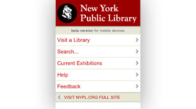
New York Public Library on a mobile device.
Content on the mobile web must be user-focused just like in traditional web design. However, presenting content with utmost consideration and forethought is all the more critical to the mobile web experience because of the smaller screens and internet connectivity concerns that aren’t issues to the traditional desktop web-browsing environment.
If you’re working on an existing site’s mobile web interface, only the essential elements should be brought over to the mobile web. Mobile users don’t want to have to look for information or scroll through multiple pages to find what they are looking; they want their needs to be met quickly.
Get into your users’ head, figure out what they’d be most interested in and give them just that (and nothing more).
Using Rich Media Effectively
Today’s smartphones are pretty capable of displaying multimedia content. And that’s a good thing.

Facebook mobile version.
You can watch a YouTube video while riding on the train or view photos of your drunken escapades last night that your friend posted on Facebook.
On the other hand, keeping rich multimedia to the barest minimum or providing alternatives to users that can’t access multimedia content is essential because of internet connectivity and technology limitations that our mobile web infrastructures are still working on to improve.
Not everyone uses an iPhone that has a built-in web browser, and many mobile web users have metered mobile internet connections that can cost them an arm and a leg when viewing these hefty rich media assets.
Simplicity Equates to Usability on the Mobile Web
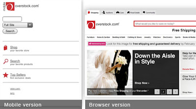
Overstock.com mobile web version versus its traditional web version.
The great part about the mobile web is its simplicity. While it’s an advantage for web designers, its significance cannot be ignored. In the mobile web design context, I’d like to say that simplicity equates to usability. Keep the design clutter-free and as lightweight as possible.
Maximize the screen real estate. Mobile web users will be able to get more out of a simple and uncluttered interface that they can navigate through.
Also, keep in mind that many mobile web users don’t have access to the traditional keyboard and mouse, so a simple design is critical in order for them to be able to move around the site with ease.
Understanding How Mobile Devices Work
The first thing most aspiring mobile web designers should educate themselves on is how websites and web applications are rendered in their target mobile devices. With so many users accessing the mobile web from many different and disparate devices, understanding and prioritizing your target devices is paramount in creating unique and effective browsing experiences.
A mobile web application designed for the iPhone will not be viewable on an S60 device. A mobile website designed for Blackberry Bold 9700 would look different on a Sony Ericsson Satio.
Knowing the users’ devices help web designers create content and experiences specifically for that device.
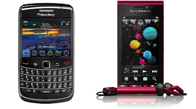
The Blackberry 9700 uses a display size of 480 x 360 pixels as compared to the Satio’s display size of 360 x 640 pixels.
Simplifying User Interaction
Make input as simple as possible. Use buttons or selection methods as much as possible. Use textboxes only when necessary and have auto-complete/auto-suggest features to reduce errors.
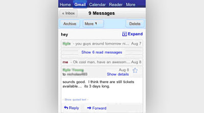
Mobile Gmail offers easy access to the most frequently used Gmail commands and mobile keypad shortcuts.
Since it’s a mobile device, shortcuts to common and repetitive site tasks are necessary. The basic reason behind this is efficiency. Accessing information on a mobile device is quite a different user experience. The display is small and the keypad is even smaller. Therefore, the use of shortcuts simplifies the whole user experience.
Empower Users with Freedom and Flexibility
Give the user more freedom and control over their actions. For example, the user should be able to choose between different font sizes, backgrounds and turn on or off whatever controls that they desire.
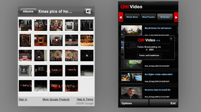
On the left, Picasa, an image sharing site. On the right, CNN Video on the mobile web.
Develop mobile web application and websites that are intuitive and offer seamless animation without affecting the overall functionality. Flash Lite is quickly becoming the norm because it’s a highly optimized mobile web application development platform. Designers should use and support these projects as a way of contributing to the growth and improvement of the mobile web landscape.
There’s no reason why the mobile web should not be every bit as interactive as its web counterpart.
How do we create better mobile web designs?
We’d like to hear your thoughts on designing for the mobile web. Do you have additional tips and important considerations that web designers should keep in mind when creating mobile web designs? What are some great examples of mobile web designs?
Share your thoughts in the comments!

No comments:
Post a Comment